Last updated on March 24th, 2026
While in DC the other week, I discovered the work of Norwood Viviano, a sculptural artist working primarily in glass who appears to be fascinated by land use, demographics, and change over time.
As an artist, Viviano explores the rise and fall of cities, turning changes in population, industry, land use, and more into art that is equally beautiful and intriguing. Viewing his work in a recent show at the Renwick Gallery in Washington, DC, I was amazed by his ability not only to represent raw data visually, but to turn it into art.
I use links to improve your experience using this website. Some may be affiliate links that pay me a small commission if you use them to book a room, rent a car, or purchase goods or services. You don’t pay extra, but it helps keep this website running. To learn more, see my policies and disclosures.
Global Cities
My favorite piece on exhibit at the Renwick was Global Cities, a room-size installation that uses hanging blown glass pendants (like large Christmas ornaments) to illustrate population change over time in 29 cities around the world. To add context, the floor below the installation shows the location of each city, with a historical timeline imprinted on the wall behind.

The shape of the glass follows population change over time, making it possible to actually see the rise and fall of the Roman Empire, the impact of two world wars, the ebb and flow of Beijing’s long history, and the newness of American cities like New York and LA.

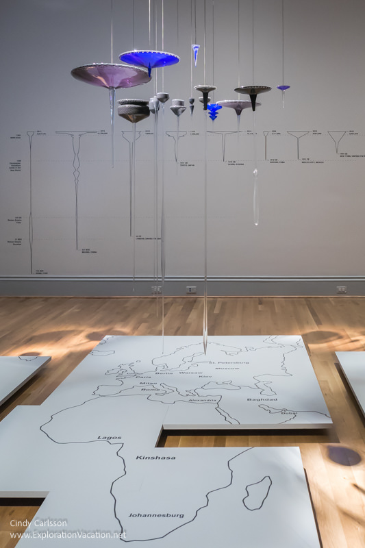
(The colors indicate a city’s age. The patterns in the glass may have meaning too, but that wasn’t clear.)
I was amazed to see such a vast amount of data presented in a form that so clearly shows both change over time and some historical context for that change. Mostly though, I loved the idea of representing generations of population change in what is essentially an ornament. It’s simple, beautiful, and easy to understand. And, wouldn’t it be fun to own one of these beautiful baubles knowing you are holding the history of a place in your hand?
Mining Industries
The Viviano exhibit also includes pieces from his Mining Industries series, which focuses on changes in density and industrial development in American cities such as Boston, Houston, New York City, and Lowell, Massachusetts.

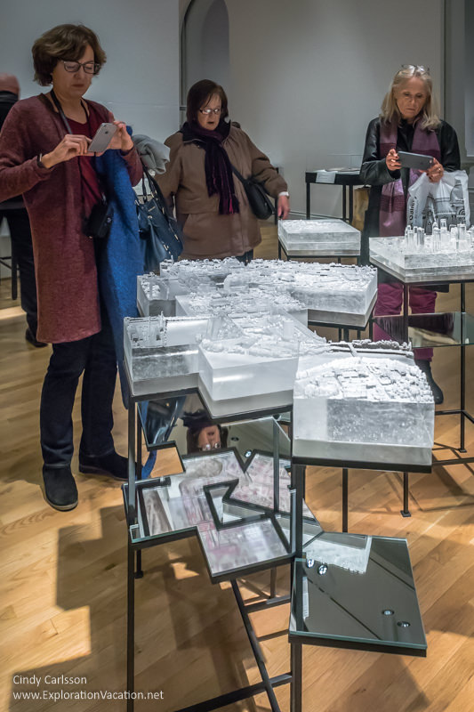
These cast glass pieces simulate the city’s current land use, while site maps layered within each piece – and visible from the bottom via mirrors – show the city’s peak industrial land use.
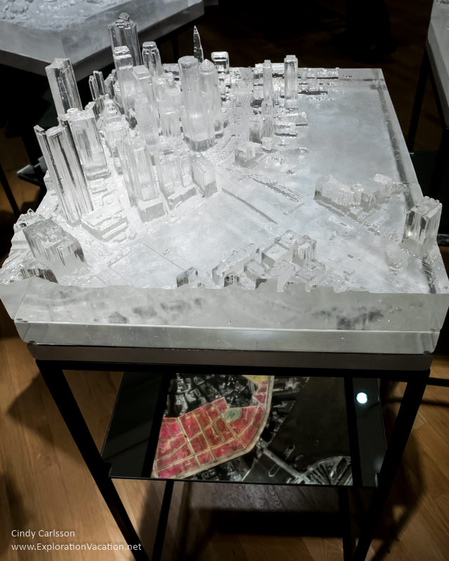

It’s a fascinating concept, but more difficult to understand than the suspended pendants in the Global Cities portion of the exhibit.
Still, like Global Cities, it shows that data and historical change can be brought to life in ways that are both illuminating and engaging. Viviano’s work should challenge us to find better ways to bring data and historical change to life. In doing so, we all will have a better understanding of where we’ve been, where we are, and (perhaps) where we may be headed.
Norwood Viviano is an Associate Professor and Sculpture Program Coordinator at Grand Valley State University in Allendale, MI. His work is on display at the Smithsonian’s Renwick Gallery in Washington, DC, through January 16, 2017. The Renwick is located behind the White House and is open daily. Like all of the Smithsonian museums, admission is free.
Renwick
Global Cities is a fascinating exhibit. I can imagine spending a fair bit of time with it. It sounds like it could be a good learning and discussion tool to use with students too.
Yes, Donna, I think it would be great for students because it does such a great job of taking a lot of really abstract-seeming data and making it really visual — much better than a graph! Thanks for stopping by.